
Organizing the data
Data collected using a questionnaire is input into spreadsheet software such as “Excel,” and arranged into a form that is easy to analyze. This process is known as “creating the data set.” The following dot points describe how to create a standard data set:
- Assign ID numbers to each questionnaire, and input the data in the order of the ID numbers. In the data set, the ID numbers should be listed in the first column from top to bottom, starting with the lowest number. From the second column onwards, attributes, study-outcomes, etc., obtained through the questionnaire should be entered.
- Code the attribute data. For example, input as “male=1, female=2,” or “students living at home=1, students living at a dormitory=2”.
- Items which were not answered in the questionnaire will be treated as missing values. Leave the cell blank, or input a code that represents the missing value (99, etc.)
- Once the data set is complete, check the entered data. If there are input errors, the analysis results will not be considered reliable. Check for input errors by comparing the questionnaire with the data set. If possible, it is best if someone other than the person who input the data performs the check.
- Create a backup of the data set. By storing the copied data in multiple locations, such as removable media or cloud storage, recovery becomes easy if the data becomes corrupted while you are working on it.
By making a comparison, identifying differences in attributes or behaviors/experiences
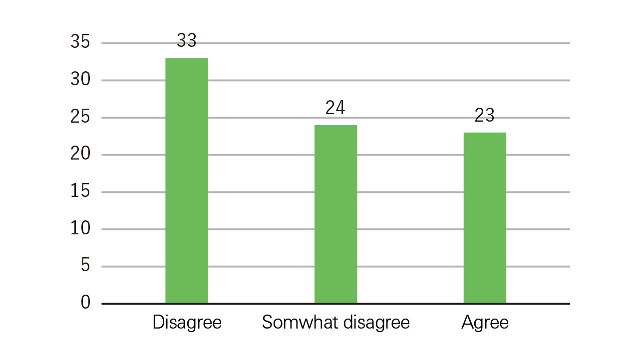
Comparison, while being a basic method to examine the characteristics of the data, is also a powerful method for obtaining interesting results. Figure 1 shows a simple aggregation of responses about university students’ interest in marriage. So, what can be said, looking at the figure? Perhaps it can be stated that many university students do not have a strong interest in marriage.
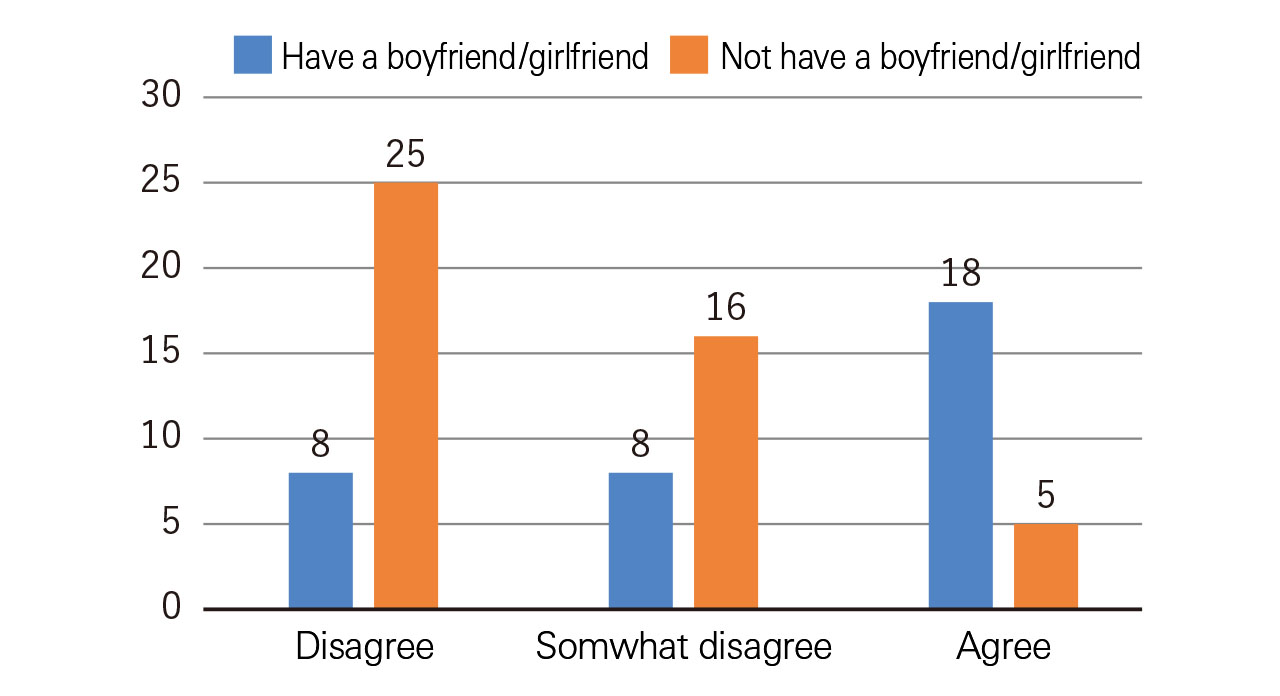
On the other hand, could the same be said when looking at Figure 2? This figure is created by aggregating the responses based on the respondents’ attributes for the same question. Information that cannot be obtained from Figure 1 became apparent.
Aggregating the collected data by attribute in this way is called “cross tabulation.” If you conduct comparisons using various attributes, it is possible to obtain interesting results.
Examining the data relationships
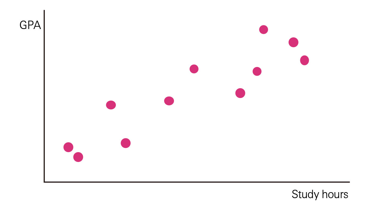
Examining a relationship between two groups of data is identifying whether there is a correlation. You can create a scatter plot to investigate and confirm whether a correlation exists.
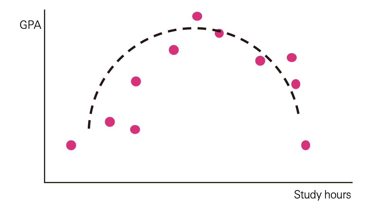
An example question would be “What relationship exists between the amount of time a university student spends studying and their GPA at the end the semester?” If there is a relationship, such as the one shown in Figure 3, it can probably be stated that students who study longer get better grades. For continuous numerical data, you should create a scatter plot.
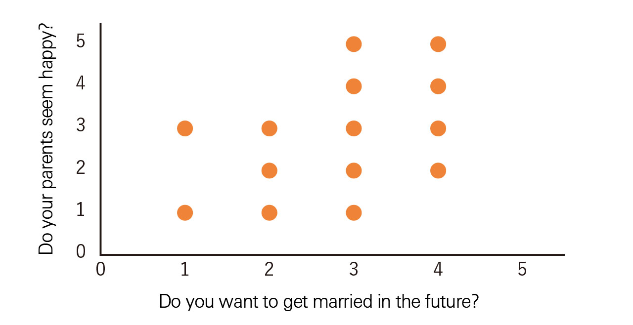
On the other hand, when looking at data obtained from surveys, you will notice that some types of questions are based on a scale. For example, the answer could range from “completely disagree” to “strongly agree.” If you use this kind of data to create a scatter plot, it will look like Figure 4, and the relationship cannot be clearly understood. In this case, calculating the “rank correlation coefficient” enables us to confirm as to whether a relationship exists.
The rank correlation coefficient is a coefficient with values ranging from 1 to 1. As the coefficient value approaches 1, the relationship becomes more positive. While, as the coefficient value approaches -1, the relationship becomes more negative. This also means that as the coefficient value approaches 0, the relationship between the two variables becomes weaker.
Be careful about spurious correlation(s)
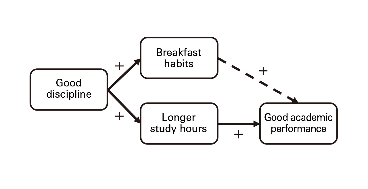
Upon hearing the statement, “people who eat breakfast everyday have better grades,” will you decide to eat breakfast every day? Based on actual surveys, there seems to be a positive correlation between the frequency of eating breakfast and school grades. However, based on only this one fact, you should not immediately make an assertion that breakfast should be taken to improve grades in school.
Taking a look at the context behind eating breakfast, you might discover that students who eat breakfast have a proper and organized lifestyle. A proper and organized lifestyle would also lead to having ample study-time. Thus, perhaps it is study time that causes good grades. Here, we see the possibility of a spurious correlation between the number of times students eat breakfast and their university grades.
Hence, when considering correlation, you need to be mindful about whether the true cause genuinely exists behind the two variables.
Developing your argument
In Figure 2, there is a difference of 8 cases versus 16 cases for the response “Do not strongly agree” between the two groups of respondents. Can it be stated that this difference is a significant one? Or is it the case that, despite there being no difference in actuality, it coincidentally seems to have a difference in this study? To confirm this, hypothesis testing is required. Moreover, in quadratic-curve relationships such as in Figure 6, the correlation function approaches 0. That is, despite a relationship existing in actuality, you could possibly overlook this. By learning basic statistics, it becomes possible to develop your argument into a better and more persuasive one.
- Recommended Reading
- Evergreen, S. (2019) Effective Data Visualization: The Right Chart for the Right Data (2nd Ed.), SAGE Publications
- Issue |
- Institute of Liberal Arts and Sciences & Center for the Studies of Higher Education
- First edition |
- 2018.3.20
- Author |
- Nakajima, Hidehiro