
Thinking about the features of materials
Slides:
Pay attention to the total number of slides and font size. The headline font should be at least 36pt and plain text at least 28pt. Aim to take 1 minute to present one slide. Rather than just using whole paragraphs on the slides, it is better to make bullet points or use conceptual diagrams.
Posters:
Posters should be easy to be captured its outline from the distance as well as contain details that become visible by seeing it up close. Use clear headlines to make the content easier to grasp, use colors only to highlight important parts of figures and tables, and visualize the overall structure as understandable at a glance.
Preparing accurate information and a logical structure
When the content is meaningful (being accurate, logical, original, novel, etc.), it is worthwhile to make an effort of preparing presentation materials. You may refer to some other guides to prepare your contents well. [→Preparing for an Effective Oral Presentation]
Aligning and grouping
Take time to align the edges of items, sections, figures, etc. If it is uneven, the readers will be distracted and have difficulty in understanding the contents properly.
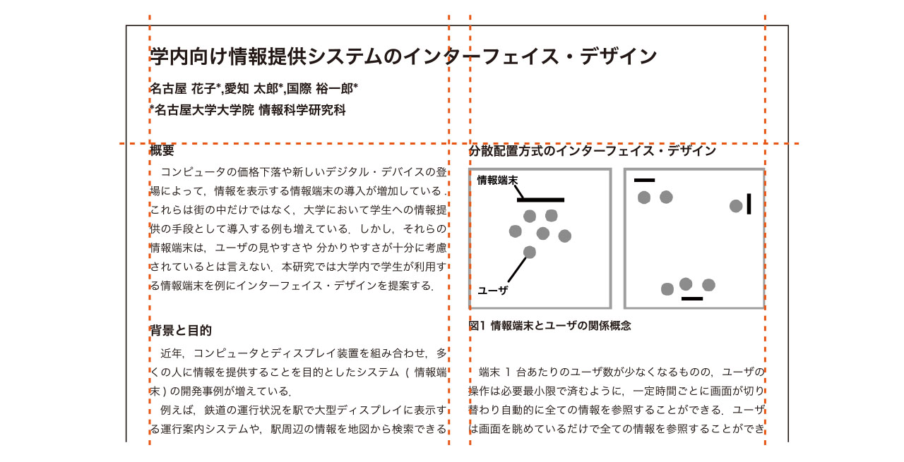
Adjust the spacing between items and columns to be grouped by contents. It makes easier for the readers to understand the structure.
Adding contrasts and unifying the design
Create clear differences between levels, for example, by using different font sizes between a title, headlines, and plain text. For the title or the headlines, you can change font colors, add lines or marks, or put the background color.
Take care to use the same design throughout all slides. For example, this includes headline fonts; lines and marks (so-called “eye-catch”); and the spaces between groups. A different design should be introduced when express a different meaning.

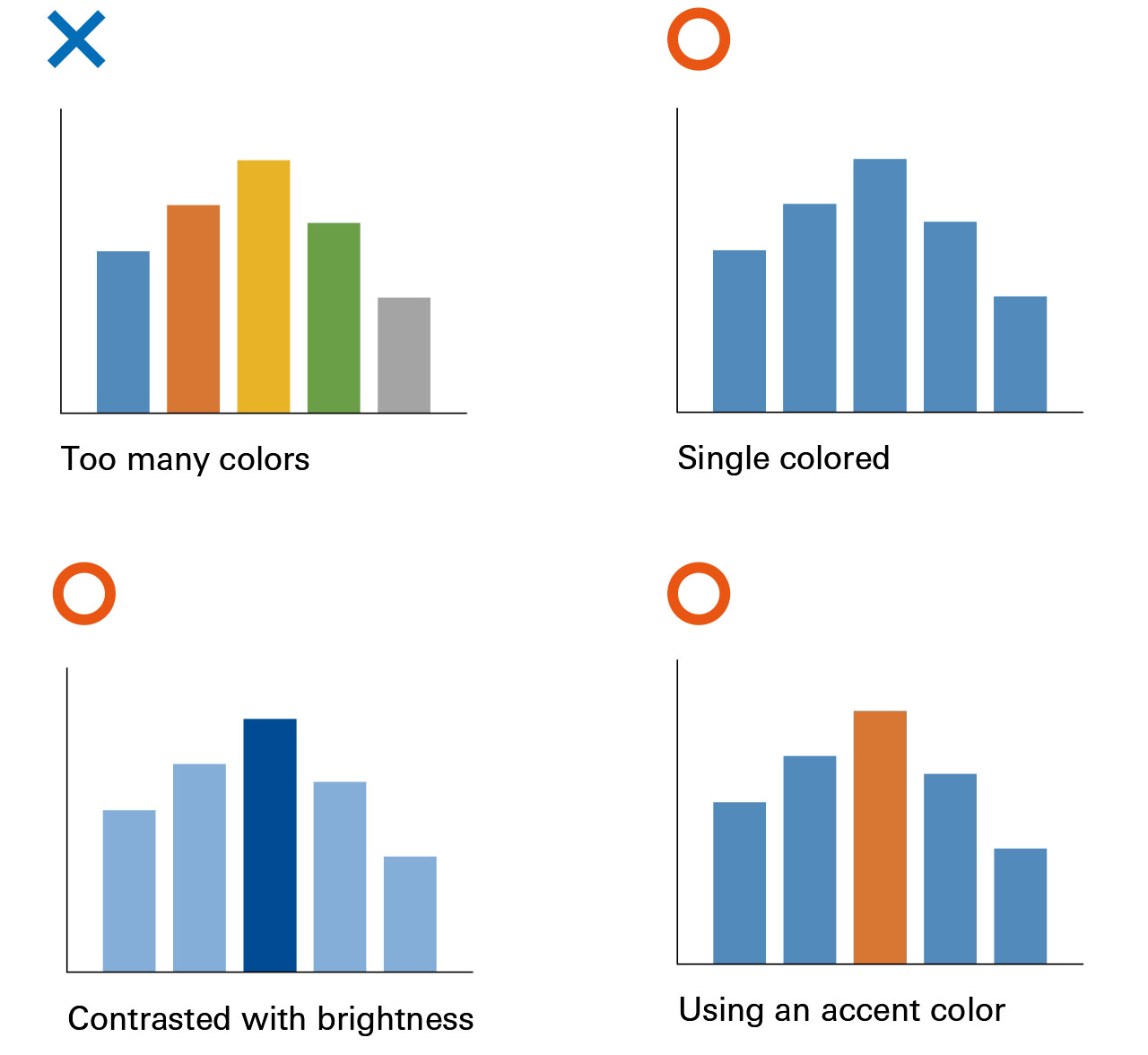
Thinking about the colors
Make sure each color a particular meaning. Using many colors without any particular meaning confuses the readers, and results in more time consumed to understand the contents. It is best to add accent colors only where you want to highlight something.
It is necessary to think about the specific type of color-sense. Avoid combinations of red and green, orange and yellowish green, blue and purple, dark brown and deep green, and grey and pink, as they can be difficult to tell apart by the specific color-sense eyes.
Checking for missing or excessive information and the overall flow
Do a final check of the slides and posters you have made. For slides, talk rehearsals help you to see if there is too much or too little information, or if improvement is needed somewhere. For posters, confirm that the readers can follow the contents easily when looking at it from a certain distance, as well as see if you can speak the summary talk of the contents within 3 minutes.
In all cases, make sure to confirm that you have all of the necessary materials to answer any possible questions. For slides, you can add such materials after the final page of the presentation. For posters, you can bring some extra materials. If there are handouts, you can add that information to them.
- Recommended Readings
- Williams, R. (2014) The Non-Designer’s Design Book (4th Ed.), Peachpit Press
- Briscoe, M. H. (1996) Preparing Scientific Illustrations: A Guide To Better Posters, Presentations, and Publications (2nd Ed.), Springer
- Issue |
- Institute of Liberal Arts and Sciences & Center for the Studies of Higher Education
- First edition |
- 2018.3.20
- Author |
- Saitoh, Yoshiko